Positive Branding for Plastics.
プラスチックのポジティブブランディング.
OK-KASEI VI Project
OK-KASEI Co., Ltd.
We were in charge of the visual identity and branding for OK Kasei Corporation, a plastic masterbatch producer headquartered in Osaka Prefecture, Japan.
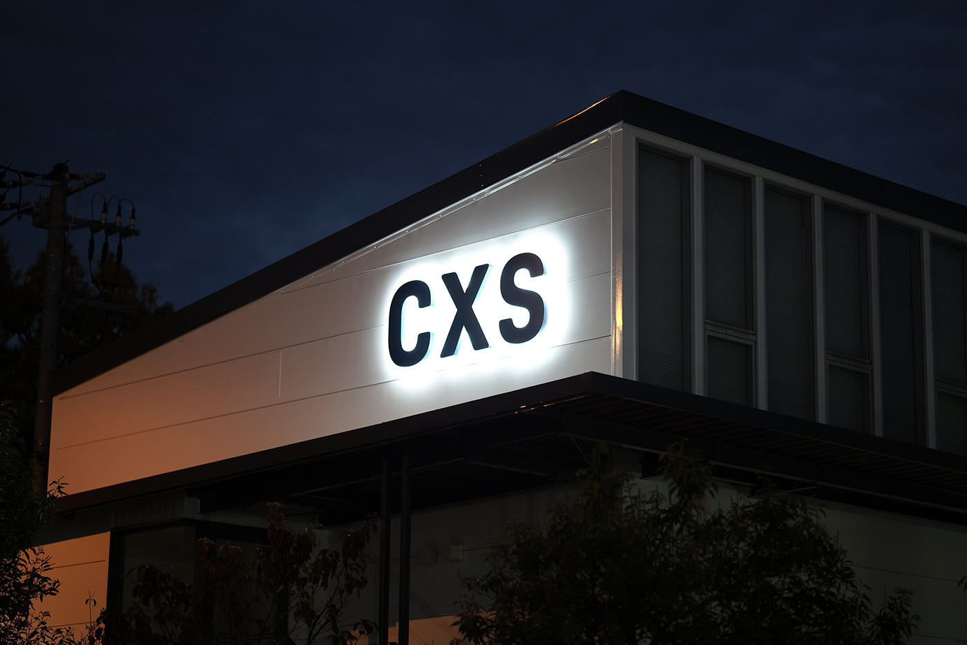
Starting with a new logotype, which had not been redesigned in decades, we have provided total direction and design which includes symbol marks, corporate colors, taglines, business cards, envelopes, cardboard boxes, product bags, websites, Instagram-related photos, building signs, factory signs, and more. The value that OK Kasei Co., Ltd. provides to its customers is not simply by providing materials, but by raising the spirits of the designers it supplies to and coloring the minds of the end users. The tagline "to color one’s heart" was chosen to represent our intention to change the current negative perception of plastic to a positive one through the accumulation of such values.
In terms of design, the hyphen in the OK-KASEI corporate logo symbolizes a pellet that makes one's heart swell, aptly named "Swelled Hyphen," and the corporate colors are the combination of color mixing with the highest difficulty to highlight OK Kasei's advanced color mixing technology. We named the color "Shinpeki," where creativity is as wide as the deep sea.
Regarding the design of communication tools, if you look closely at the single line drawn uniformly on business cards and cardboard, the beginning is slightly thickened. This is not a simple line design, but an iconic representation of the masterbatch production process. On the back of the actual pellets and bags of product that contains the masterbatch, we designed the way it is cut and turned into pellets. With such playfulness, the packaging seems to have an inherent uniqueness that can be felt inside the seriousness of OK Kasei.
大阪府に本社を構える、プラスチックのマスターバッチを生産するオーケー化成株式会社のVIとブランディングを担当しました。
シンボルマーク、コーポレートカラー、タグライン、名刺、封筒、段ボール、製品袋、ウェブサイト、Instagram用撮影、建屋の看板や工場のサインなどをトータルでディレクションおよびデザインをしてきました。オーケー化成株式会社がお客様へ提供する価値は単純な素材提供ではなく、提供先のデザイナーの方の気持ちを高めたり、その先のエンドユーザーの心を色づかせたりすることです。そのことを積み重ねることでネガティブに考えられがちな現在のプラスチックへの価値観をポジティブに転換させることを意図とし、タグラインを「ココロイロヅク」とさせていただきました。
デザイン面ではOK-KASEIというコーポレートロゴの中にあるハイフンにあたる部分は、気持ちが膨らむペレットである「Swelled Hyphen(スウェルドハイフン)」と称してシンボルマーク化し、コーポレートカラーはオーケー化成株式会社が誇る高い調色技術を前面に出すために調色の難易度が高いカラーを定義させていただき、創造性が高い深い海の色として「深碧(しんぺき)」とネーミングさせていただきました。
コミュニケーションツールのデザインについてですが、名刺や段ボールに統一して描かれている一本のラインはよく見ると始まりを少し太くしています。これは単純なラインの意匠ではなく、マスターバッジの生産工程をアイコン化したもので、実際のペレットやマスターバッチを入れる製品の袋の背面にはそれがカットされてペレットになる様をデザイン。そうした遊び心を持ってオーケー化成の真面目さの中にも、本来持つユニークさも感じてもらえるパッケージとなっているように思います。
Art Director / Kairi Eguchi (KAIRI EGUCHI STUDIO Inc.)
Graphic Designer / Anzu Fujihara (KAIRI EGUCHI STUDIO Inc.)
Product Designer / Kairi Eguchi (KAIRI EGUCHI STUDIO Inc.)
Photographer / Kairi Eguchi, Anzu Fujihara (KAIRI EGUCHI STUDIO Inc.)
Graphic Designer / Anzu Fujihara (KAIRI EGUCHI STUDIO Inc.)
Product Designer / Kairi Eguchi (KAIRI EGUCHI STUDIO Inc.)
Photographer / Kairi Eguchi, Anzu Fujihara (KAIRI EGUCHI STUDIO Inc.)